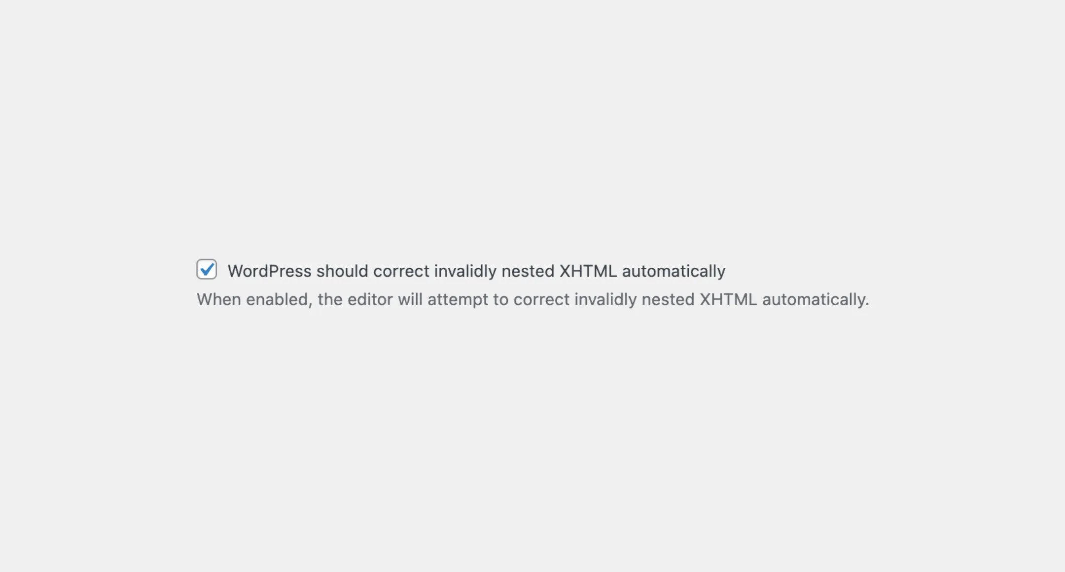
Checkbox
The Checkbox component represents the HTML checkbox input element. You can
use it to allow users to select an option. You can either use it as a
standalone or as part of a group with the CheckboxGroup
component.
Usage
To use the component, import the Checkbox from the package:
import { Checkbox } from "@syntatis/kubrick";You can then add it to your app by passing the label prop to provide a label for the checkbox input, additionally with the name prop to uniquely identify it on form submission:
<Checkbox label="I agree to the terms and conditions" name="agree" />Disabled
Similar to the standard HTML checkbox input element, you can also make the Checkbox component disabled by passing the isDisabled prop.
<Checkbox label="I agree to the terms and conditions" name="agree" isDisabled />Read-only
You can also set the input as read-only by passing the isReadOnly prop, which will prevent the user from changing the check state:
<Checkbox label="I agree to the terms and conditions" isReadOnly />Description
Aside of the label, you can add a description to add more context or instructions for the users. You can do this by passing the description prop:
<Checkbox label="I agree to the terms and conditions" description="Please read the terms and conditions before checking this box." />Value
The Checkbox component is not selected by default. This means that when the component is first loaded, the checkbox will appear unchecked. However, if you want the checkbox to be checked initially, you can use the defaultSelected prop. This is useful when you want an option to be pre-selected, like agreeing to terms or enabling specific settings by default.
<Checkbox label="I agree to the terms and conditions" description="Please read the terms and conditions before checking this box." defaultSelected />Styles
The Checkbox component has static classes, prefixed with .kubrick-Checkbox-. You can use these static classes to
select and customize the component and its elements.
| Selector | Description |
|---|---|
root | The root element of the checkbox. |
label-content | The wrapper element of the label content. |
description | The wrapper element of the description. |
Events
The Checkbox component will emit some events on user
interactions. You can handle these events by passing a function as a
callback to the following props:
| Event | Description |
|---|---|
onChange | Triggered when the check state changes. The callback function will receive the new check state as a boolean. |
onFocusChange | Triggered when the input receives or loses focus. The callback function will receive a boolean indicating if the input is focused. |
Let’s assume you have a Checkbox component and a button within your app. You want to disable the button until the user check the checkbox.
You can achieve that by using the onChange prop to handle the check state change event and update the button state accordingly. The onChange prop will directly pass the new check state to the function as a boolean, so you can directly use it to update the state as shown in the example above, for example:
import { useState } from "react";
function App() {  const [isChecked, setIsChecked] = useState(false);
  return (    <>      <Checkbox        label="I agree to the terms and conditions"        onChange={setIsChecked}      />      <Button isDisabled={!isChecked}>Submit</Button>    </>  );}