CheckboxGroup
The CheckboxGroup component is a special component, designed to group a set
of Checkbox components together. It is a useful component for grouping
related checkboxes and allowing users to select multiple options. You can also
choose whether to arrange these checkboxes horizontally or vertically.
Usage
To use the CheckboxGroup, you’ll typically need to import both the CheckboxGroup and Checkbox components from the package:
import { CheckboxGroup, Checkbox } from "@syntatis/kubrick";Then, in your app, you can create a group of checkboxes by adding the label and name props to the CheckboxGroup component and adding multiple Checkbox components inside it. Each checkbox within the group should have a unique value to represent different options:
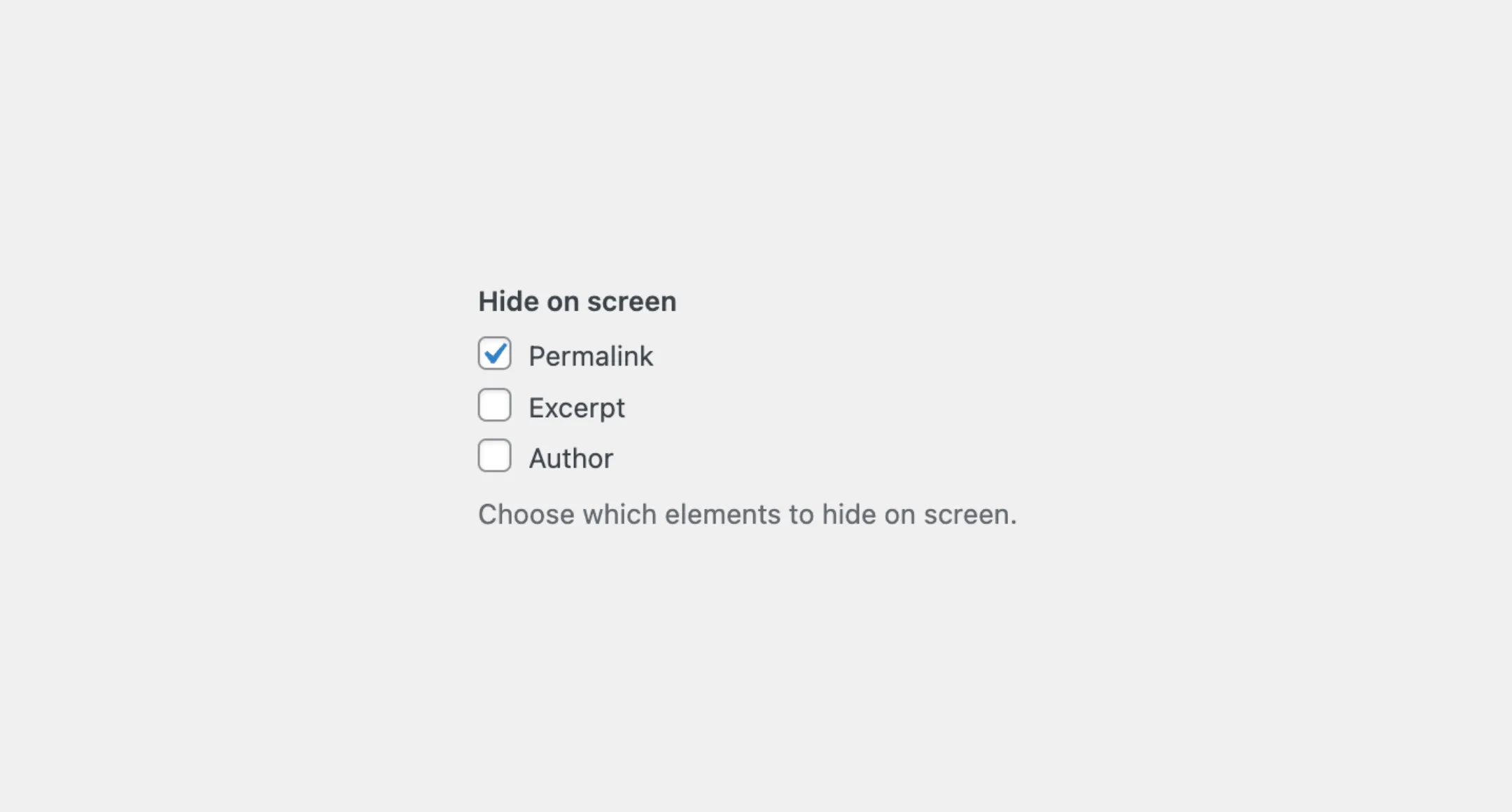
<CheckboxGroup label="Hide on screen" name="hide_on_screen"> <Checkbox label="Permalink" value="permalink" /> <Checkbox label="Excerpt" value="excerpt" /> <Checkbox label="Author" value="author" /></CheckboxGroup>Disabled
Similar to the Checkbox component, you can mark the group as disabled by passing the isDisabled prop:
<CheckboxGroup label="Hide on screen" name="hide_on_screen" isDisabled> <Checkbox label="Permalink" value="permalink" />2 collapsed lines
<Checkbox label="Excerpt" value="excerpt" /> <Checkbox label="Author" value="author" /></CheckboxGroup>Read-only
Or, mark all the checkboxes within the group as read-only with the isReadOnly prop:
<CheckboxGroup label="Hide on screen" name="hide_on_screen" isReadOnly> <Checkbox label="Permalink" value="permalink" />2 collapsed lines
<Checkbox label="Excerpt" value="excerpt" /> <Checkbox label="Author" value="author" /></CheckboxGroup>Description
You can also add a description to the CheckboxGroup component to provide additional information, instruction, or context about the group of checkboxes:
<CheckboxGroup label="Hide on screen" name="hide_on_screen" description="Select the items you want to hide on the screen."> <Checkbox label="Permalink" value="permalink" />2 collapsed lines
<Checkbox label="Excerpt" value="excerpt" /> <Checkbox label="Author" value="author" /></CheckboxGroup>Styles
The CheckboxGroup component has static classes, prefixed with .kubrick-CheckboxGroup-. You can use these static classes to
select and customize the component and its elements.
| Selector | Description |
|---|---|
root | The root element of the checkbox group. |
label | The wrapper element of the group label. |
items | The wrapper element containing all the checkboxes. |
description | The wrapper element of the group description. |
Events
The CheckboxGroup component will emit some events on user
interactions. You can handle these events by passing a function as a
callback to the following props:
| Event | Description |
|---|---|
onChange | Triggered when the check state changes. The callback function will receive an array of values representing the checked checkboxes. |
onFocusChange | Triggered when the input receives or loses focus. The callback function will receive a boolean indicating if the input is focused. |
You can listen to the onChange event to handle the changes of checkboxes state within the group.
import { useState } from "react";
function App() {  const [selection, setSelection] = useState([]);
  return (    <CheckboxGroup      label="Hide on screen"      name="hide_on_screen"      onChange={setSelection}>      <Checkbox label="Permalink" value="permalink" />2 collapsed lines      <Checkbox label="Excerpt" value="excerpt" />      <Checkbox label="Author" value="author" />    </CheckboxGroup>  );}
As mentioned the callback on the onChange prop will receive an array of values representing the checked checkboxes. In the above example, if the permalink and author checkboxes are checked, the selection state will be ['permalink', 'author'].