TextArea
The TextArea component works like a standard HTML textarea element. It
allows users to enter and edit multiple lines of plain text. This component is
useful for collecting user input that requires more than one line of text in
forms.
Usage
To use the component, import the TextArea component from the package:
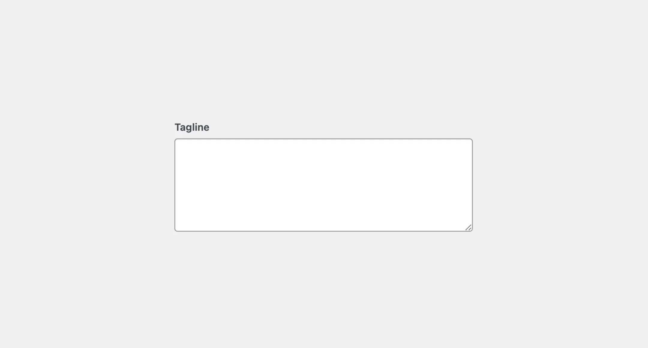
import { TextArea } from "@syntatis/kubrick";Then, you can use it in your application by adding the TextArea component with the label prop to provide a label for the textarea, additionally with the name prop to uniquely identify the textarea when on form submission:
<TextArea label="Tagline" name="tagline" />Placeholder
You can add a placeholder text on the TextArea component by using the placeholder prop to provide a hint to users on what to enter in the textarea:
<TextArea label="Tagline" name="tagline" placeholder="Enter tagline for your site or blog"/>Disabled
You can disable the TextArea component by adding the isDisabled prop. This will prevent users from interacting with the textarea and the input value will not be carried over on form submission:
<TextArea label="Tagline" name="tagline" isDisabled />Read-only
You can make the TextArea component read-only by adding the isReadOnly prop. This will prevent users from editing the textarea, but the input value will still be carried over on form submission:
<TextArea label="Tagline" name="tagline" isReadOnly />Rows
Similar to the HTML textarea element, you can customize the TextArea component by using the rows prop to define the number of visible text lines in the textarea. By default, the TextArea component uses the 5 rows. You can change it to the other number, for example:
<TextArea label="Tagline" rows={10} name="tagline" />Cols
Similarly, you can also customize the TextArea component by using the cols prop to define the number of visible characters in a line in the textarea. By default, the TextArea component uses the 50 columns. You can change it to the other number, for example:
<TextArea label="Tagline" cols={30} name="tagline" />Description
You can add a description to the TextArea component by providing a valid JSX element as the description prop. This section can be particularly useful for providing additional information or instructions to users:
<TextArea label="Tagline" name="tagline" description="Please provide a detailed description of the issue."/>Styles
The TextArea component has static classes, prefixed with .kubrick-TextArea-. You can use these static classes to
select and customize the component and its elements.
| Selector | Description |
|---|---|
root | The root element of the `TextArea` component. |
label | The label element. |
textarea | The textarea input. |
description | The wrapper element of the description content. |
Events
The TextArea component will emit some events on user
interactions. You can handle these events by passing a function as a
callback to the following props:
| Event | Description |
|---|---|
onChange | Triggered when the value is changed. The function callback will receive the new input value as an argument. |