TextField
The TextField component works like a standard HTML input element. It
allows users to enter and edit plain text. This component is useful for
collecting user input in forms.
Usage
To use the component, import the TextField component from the package:
import { TextField } from "@syntatis/kubrick";Then, you can use it in your app by adding the TextField component with the label prop to provide a label for the input field, additionally with the name prop to uniquely identify the input field when on form submission:
<TextField label="Name" name="name" />Value
The TextField component works similar to the input HTML element. Value will be empty, by default. You can set a value on to the input with the value or defaultValue prop.
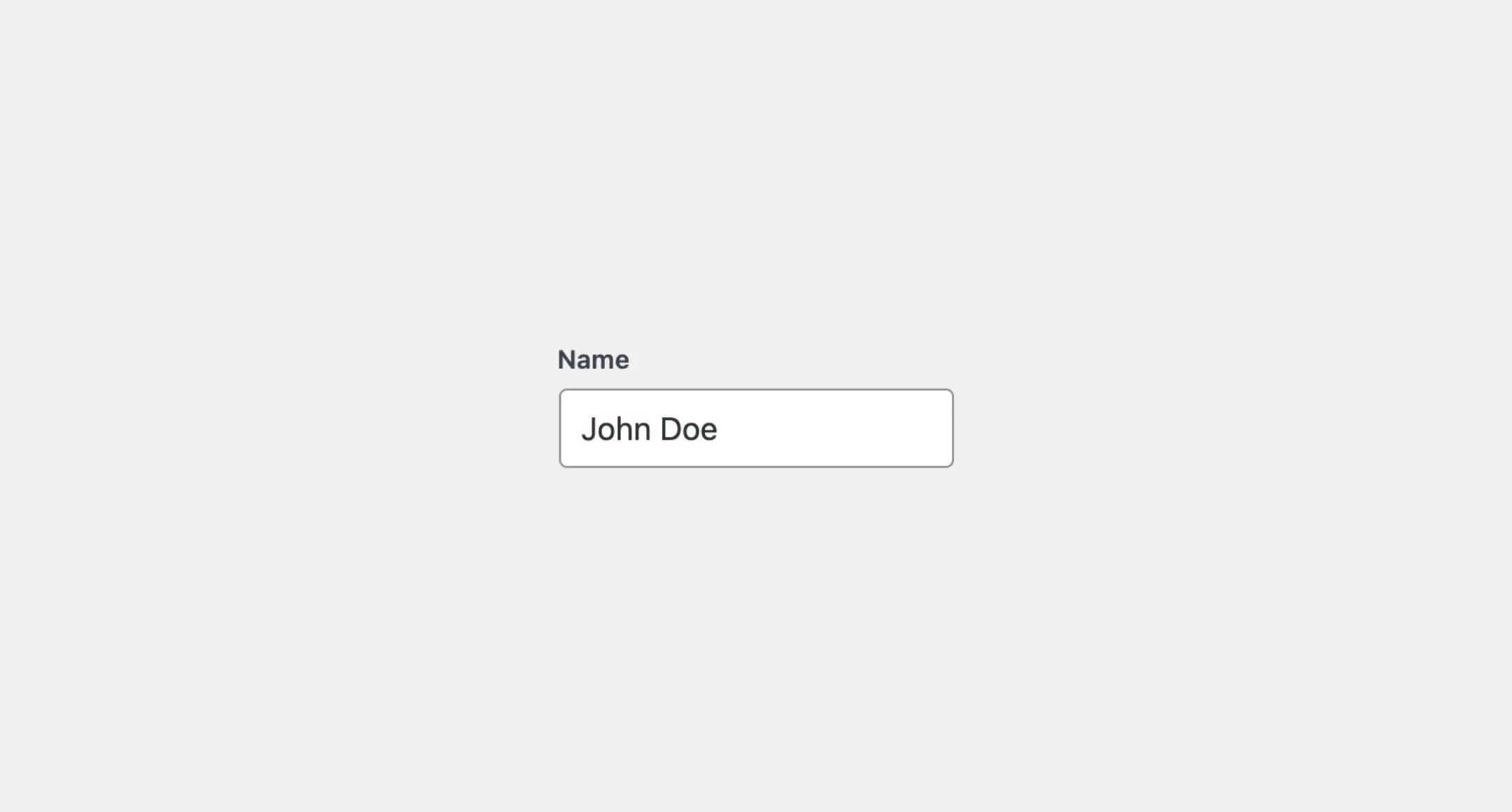
<SearchField label="Name" name="name" defaultValue="John Doe" />Disabled
You can disable the TextField component by adding the isDisabled prop. This will prevent users from interacting with the input field and the input value will not be carried over on form submission:
<TextField label="Name" name="name" isDisabled />Read-only
You can make the TextField component read-only by adding the isReadOnly prop. This will prevent users from editing the input field, but the input value will still be carried over on form submission:
<TextField label="Name" name="name" isReadOnly />Type
Similar to the HTML input element, you can customize the TextField component by using the type prop to define what kind of text input you need from users. By default, the TextField component uses the text type. You can change it to the other type such as the password and email type:
<TextField label="name" name="name" /> // Default type is "text".<TextField label="Password" type="password" name="password" /><TextField label="Email" type="email" name="email" />Placeholder
You can add a placeholder text on the TextField component by using the placeholder prop to provide a hint to users on what to enter in the input field:
<TextField label="Name" name="name" placeholder="Enter your name" />Description
You can add a description text below the TextField component by using the description prop to provide additional information to users:
<TextField label="Name" name="name" description="Enter your full name" />By default, the description text will be displayed as a small text below the input field. You can change where the description text is displayed by using the descriptionArea prop. The descriptionArea prop accepts before-input and after-input (default) values. Set it to before-input to display the description text above the input field, right below the label:
<TextField label="Name" name="name" description="Enter your full name" descriptionArea="before-input" />Styles
The TextField component has static classes, prefixed with .kubrick-TextField-. You can use these static classes to
select and customize the component and its elements.
| Selector | Description |
|---|---|
root | The component root element. |
label | The wrapper element of the input label. |
input | The input element. |
description | The wrapper element of the description content. |
Events
The TextField component will emit some events on user
interactions. You can handle these events by passing a function as a
callback to the following props:
| Event | Description |
|---|---|
onChange | Trigger when the input value changes. The callback function receives the new value as the argument. |
Let’s assume you have TextField component in your app. You want to update the name on the heading when the user types in the input field. You can use the onChange prop to handle this event, for example:
import { useState } from "react";
function App() {  const [name, setName] = useState("John Doe");
  return (    <>      <h1>Hi, {name}</h1>      <SearchField        label="Name"        name="name"        value={name}        onChange={setName}        />    </>  );}