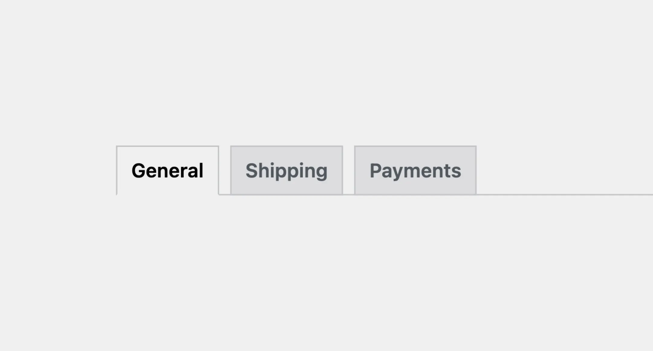
Tabs
The Tabs component helps organize content into sections, with each section
represented by a tab. When a user clicks or selects a tab, the related content
is shown, while the other tabs content is hidden allowing them to focus on the
selected section. The Tabs component is especially useful when you need to
present multiple categories of information or features.
Usage
To use it in your app, import both the Tabs and Tab components from the package:
import { Tabs, Tab } from "@syntatis/kubrick";Then, you can add Tabs component with the Tab components as its children in your app as follows. Each Tab component should have the title prop to provide the tab title and the key prop to uniquely identify the tab:
<Tabs> <Tab key="general" title="General"> <p>General settings</p> </Tab> <Tab key="advanced" title="Advanced"> <p>Advanced settings</p> </Tab> <Tab key="help" title="Help"> <p>Help and support</p> </Tab></Tabs>Selected
By default, the selected tab is the first tab in the list. You can set a different tab to be selected by adding the defaultSelectedKey and define the key of the tab you want to be selected.
<Tabs defaultSelectedKey="advanced"> <Tab key="general" title="General"> <p>General settings</p> </Tab> <Tab key="advanced" title="Advanced"> <p>Advanced settings</p> </Tab> <Tab key="help" title="Help"> <p>Help and support</p> </Tab></Tabs>In this example, it will make the advanced tab appears as active and its content will be shown even though it’s not on the first on the list and the user hasn’t clicked on it yet. Users will still be able to select a different tab if they want.
Disabled
You can add the isDisabled prop to the Tabs component to disable the tabs that will prevent users from interacting with them.
<Tabs isDisabled> <Tab key="general" title="General"> <p>General settings</p> </Tab> <Tab key="advanced" title="Advanced"> <p>Advanced settings</p> </Tab> <Tab key="help" title="Help"> <p>Help and support</p> </Tab></Tabs>Alternatively, you can add disabledKeys prop to the Tabs component to disable only specific tabs by providing an array of keys.
<Tabs disabledKeys={["advanced", "help"]}> <Tab key="general" title="General"> <p>General settings</p> </Tab> <Tab key="advanced" title="Advanced"> <p>Advanced settings</p> </Tab> <Tab key="help" title="Help"> <p>Help and support</p> </Tab></Tabs>Styles
The Tabs component has static classes, prefixed with .kubrick-Tabs-. You can use these static classes to
select and customize the component and its elements.
| Selector | Description |
|---|---|
root | The component root element. |
items | The wrapper element containing the tab items. |
item | The wrapper element that represents a tab item. |
panel | The wrapper elements that represents the content panel of the tab. |
Events
The Tabs component has static classes, prefixed with .kubrick-Tabs-. You can use these static classes to
select and customize the component and its elements.
| Selector | Description |
|---|---|
onSelectionChange | Triggered when the user switches between tabs. The callback function will receive the key of the selected tab as an argument. |