Switch
The Switch component is a toggle switch that you can use to enable or
disable a setting or feature in your application. It’s especially useful to
let users turn something on or off or when you have any binary option that
users need to switch between.
Usage
To use the component, import the Switch from the package:
import { Switch } from "@syntatis/kubrick";Then, you can use it in your application by adding the Switch component with the label prop to provide the label for the switch input:
<Switch label="Show in REST API" name="show_in_rest" />Selected
You can set the switch input to be selected by default by adding the defaultSelected prop to the Switch component. This will make the switch appear as when it’s toggled on. Users will be able to toggle it off if they want.
<Switch label="Show in REST API" name="show_in_rest" defaultSelected />If you control the selected state through an external state, you can use the isSelected prop instead to set the selected state of the switch input:
import { useState } from "react";import { Switch } from "@syntatis/kubrick";
function App() {  const [isSelected, setIsSelected] = useState(false);
  return (    <Switch      label="Show in REST API"      name="show_in_rest"      isSelected={isSelected}      onChange={setIsSelected}    />  );}
Disabled
You can disable the switch input by adding the isDisabled prop to the Switch component. This will disable the entire switch input. It will appear grayed out and users won’t be able to navigate the input, interact or toggle the switch:
<Switch label="Show in REST API" name="show_in_rest" isDisabled />Read-only
You can set the switch input as read-only by adding the isReadOnly prop to the Switch component. This will prevent the user from changing the switch state. The switch will still appear interactive, but users won’t be able to toggle it.
<Switch label="Show in REST API" name="show_in_rest" defaultSelected isReadOnly/>Description
You can add a description to the switch input to provide more context to the user. You can do this by adding the description prop to the Switch component:
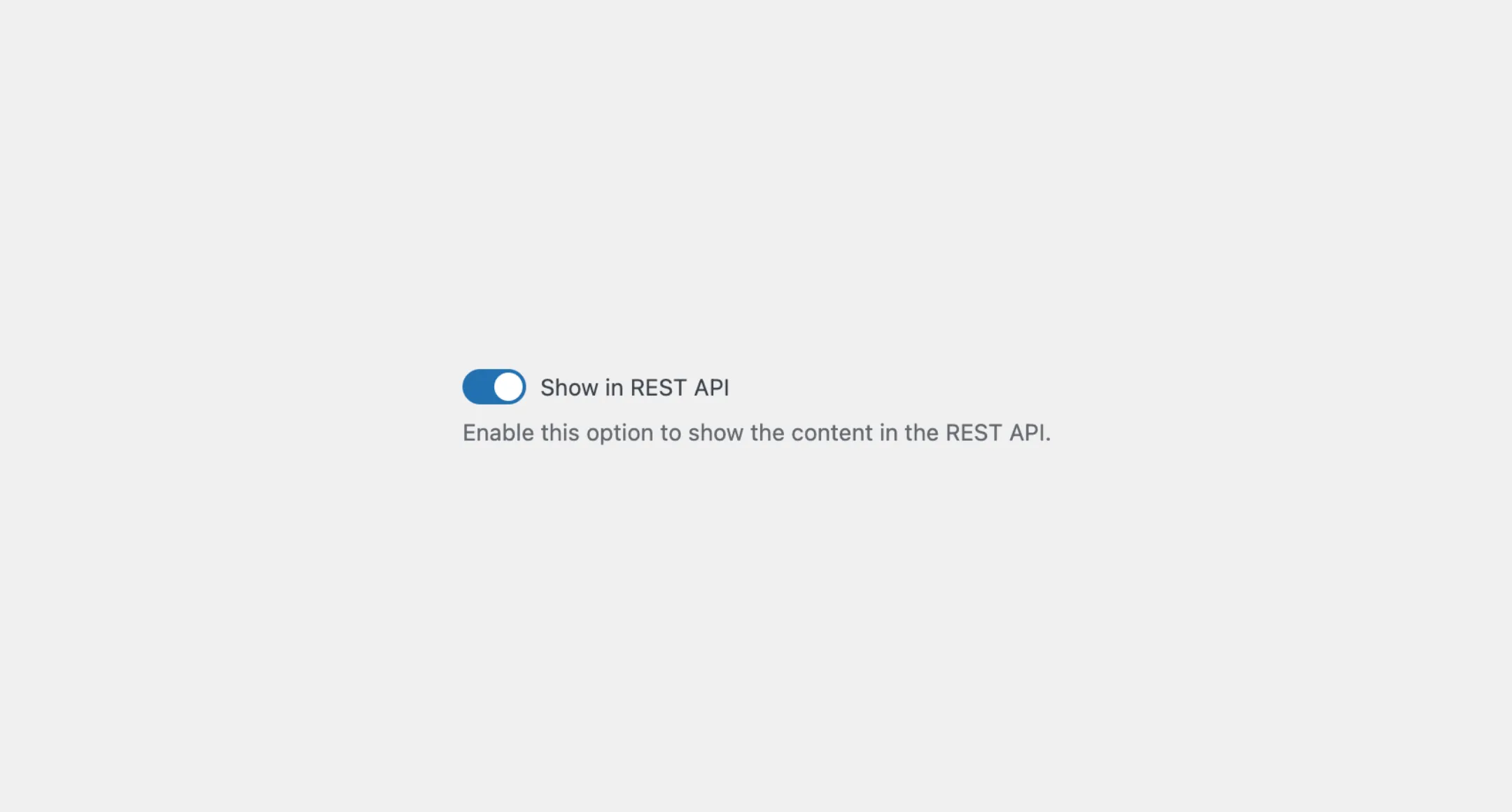
<Switch label="Show in REST API" name="show_in_rest" description="Enable this option to show the content in the REST API."/>Styles
The Switch component has static classes, prefixed with .kubrick-Switch-. You can use these static classes to
select and customize the component and its elements.
| Selector | Description |
|---|---|
root | The component root element. |
input | The element on the `Switch` component that appears as the input. |
label | The element that wraps the label text. |
description | The element that wraps the description text. |
Events
The Switch component has static classes, prefixed with .kubrick-Switch-. You can use these static classes to
select and customize the component and its elements.
| Selector | Description |
|---|---|
onChange | Triggered when the user toggles the switch input on and off. The function callback will receive the new selected state as a boolean. |