Select
The Select component works like the standard HTML select element, allowing
you to create a dropdown menu with options for users to choose from. You can
organize the options into groups, making it easier to manage and display
related choices together, which is especially useful when you have a long list
of options and want to group similar ones for a cleaner look.
Usage
To use it in your app, import both Select and Option from the package:
import { Select, Option } from '@syntatis/kubrick';Then, add the Select component with the label prop to provide a label for the select field, and the name prop to define the name of the select field when submitting the form.
You will also need to provide the options by adding the Option components. Each Option component should have a value prop to define the value of the option.
<Select label="Site Language" name="site_language"> <Option value="en_US">English (United State)</Option> <Option value="id_ID">Indonesia</Option></Select>Disabled
You can disable the select field by adding the isDisabled prop to the Select component. This will disable the entire select field, and users won’t be able to interact with it or select any options:
<Select label="Site Language" isDisabled> <Option value="en_US">English (United State)</Option> <Option value="id_ID">Indonesia</Option></Select>Selected
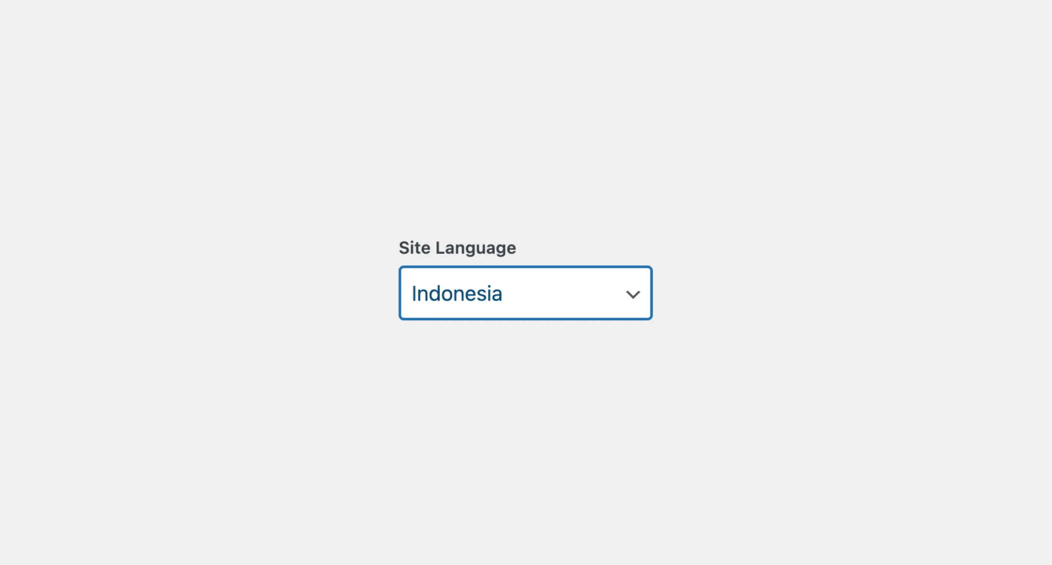
You can set the selected option by passing the selectedItem prop to the Select component with the value of the selected option. This will make the selected option appear as the default value when the select field is rendered:
<Select label="Site Language" selected="id_ID"> <Option value="en_US">English (United State)</Option> <Option value="id_ID">Indonesia</Option></Select>Events
The Select component will emit some events on user
interactions. You can handle these events by passing a function as a
callback to the following props:
| Event | Description |
|---|---|
onSelectionChange | Trigger when the user selects an option, or when the selection is changed. The callback function will receive the value of the selected option. |
onFocusChange | Triggered when the select field receives or loses focus. The callback function will receive a boolean value indicating whether the select field is focused or not. |
Let’s assume we have an app with a Select component, and we’d like to show an additional input when the user selects the “Indonesia” option. We can use the onSelectionChange prop to handle this event, for example:
import { useState } from "react";
const App = () => {  const [showInput, setShowInput] = useState(false);
  return (    <>      <Select        label="Site Language"        onSelectionChange={(value) => setShowInput(value === "id_ID")}      >        <Option value="en_US">English (United State)</Option>        <Option value="id_ID">Indonesia</Option>      </Select>      {showInput && <input type="text" />}    </>  );};
Styles
The Select component has static classes, prefixed with .kubrick-Select-. You can use these static classes to
select and customize the component and its elements.
| Selector | Description |
|---|---|
root | The root element of the component. |
label | The wrapper element of the label. |
input | The HTML select element. |
description | The wrapper element of the description content. |