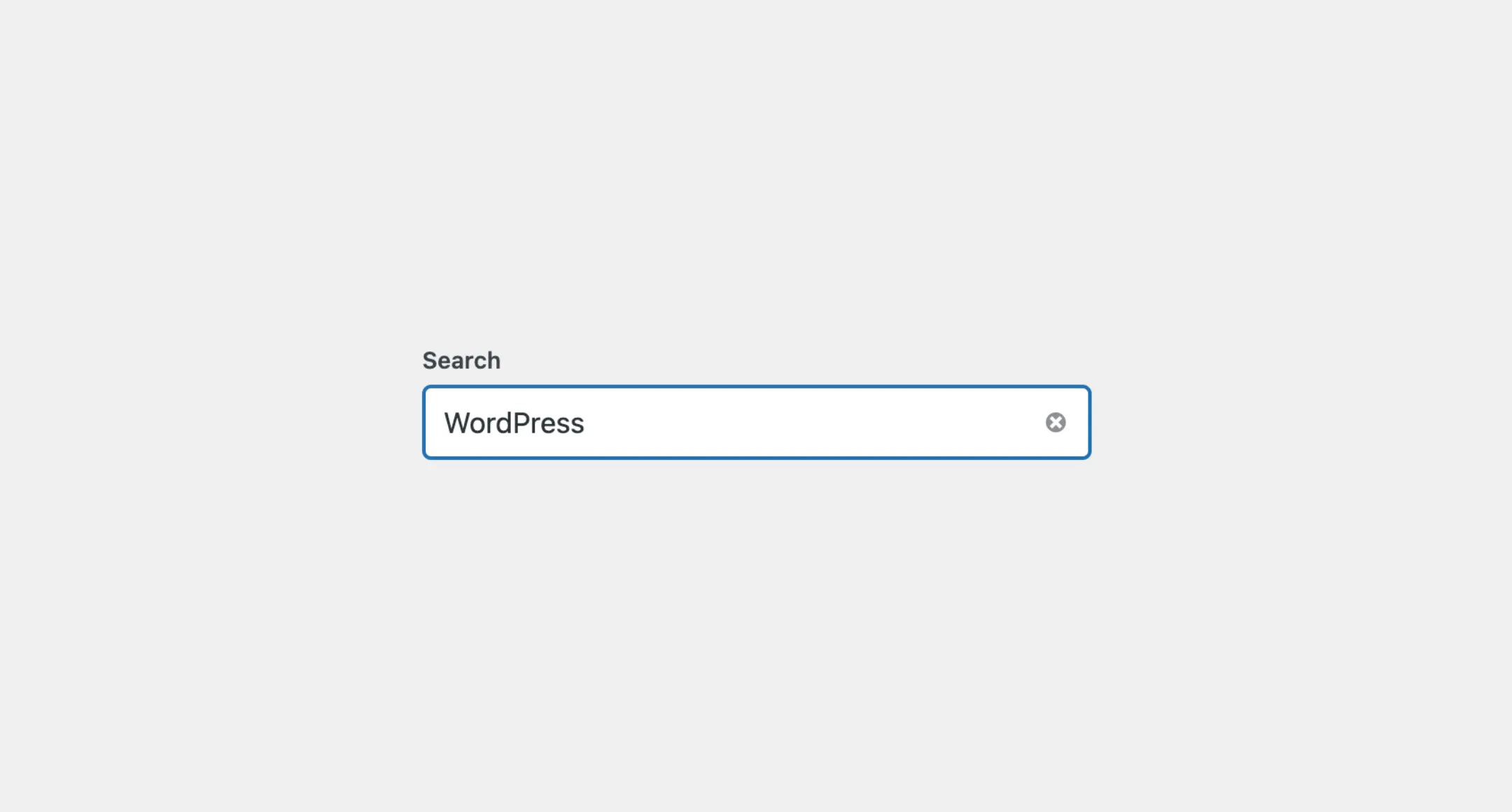
SearchField
The SearchField component provides a simple way to add a search input field
to your application. It works like a regular text input but is specifically
designed for search functionality. The field includes an input area where
users can type their search query, and it automatically adds a clear button so
users can easily reset the search field with one click, making it quick and
easy for users to clear out search terms and start a new search.
Usage
To use it in your app, import SearchField from the package:
import { SearchField } from "@syntatis/kubrick";Then, you can use it in your app by adding the SearchField component with the label prop to provide a label for the search field:
<SearchField label="Search" />Placeholder
You can also add a placeholder text to the search field by adding the placeholder prop, similar to how you would with a regular text input This text will appear in the input field when it is empty:
<SearchField label="Search" placeholder="e.g. WordPress..." />Disabled
Similarly, you can disable the search field by adding the isDisabled prop to the SearchField component. This will prevent users from typing in the search field or submitting a search query:
<SearchField label="Search" isDisabled />Read-only
You can also mark the search field as read-only by adding the isReadOnly prop. You don’t particularly need to use this prop, but it can be useful if you want to display the search field without allowing users to change the query, for whatever reason:
<SearchField label="Search" value="WordPress" isReadOnly />Description
You can also additional context or instruction to the search field by providing a description with the description prop. The description will appear as a small text will appear below the search field:
<SearchField label="Search" placeholder="e.g. WordPress..." description="Enter a keyword to search for posts, pages, or other content."/>Use descriptionArea prop to change the description placement area. The prop accepts two valid values before-input and after-input (the default). You can set it to before-input to place the description above the search field, right below the text label:
<SearchField label="Search" placeholder="e.g. WordPress..." description="Enter a keyword to search for posts, pages, or other content." descriptionArea="before-input"/>Styles
The SearchField component has static classes, prefixed with .kubrick-SearchField-. You can use these static classes to
select and customize the component and its elements.
| Selector | Description |
|---|---|
root | The root element of the component. |
label | The wrapper element of the label. |
input | The input element. |
description | The wrapper element of the description content. |
Events
The SearchField component will emit some events on user
interactions. You can handle these events by passing a function as a
callback to the following props:
| Event | Description |
|---|---|
onChange | Triggered when the input value changes. The function callback will receive the new input value as an argument. |
onSubmit | Triggered when the user submits the search query. The function callback will receive the search query as an argument. |
onClear | Triggered when the user clears the search field. The function callback will not receive any argument. |
Let’s assume you have a SearchField in your app. You’d like to capture the value of the search field when the user submits the search query, and send it to an external endpoint. We can use the onSubmit prop to handle this event, for example:
import { useEffect, useState } from "react";import { SearchField } from "@syntatis/kubrick";
function App() {  const [query, setQuery] = useState("");
  useEffect(() => {    if (query) {      // Do the fetch fetch();    }  }, [query]);
  return (    <SearchField      label="Search"      placeholder="e.g. WordPress..."      onSubmit={setQuery}    />  );}