RadioGroup
The RadioGroup component helps manage a group of Radio buttons. It handles
the state for the group and provides the necessary accessibility features.
This component is useful when you need to show multiple options, but the user
should only pick one.
Usage
To use it in your app, you will need to import both the RadioGroup and Radio components from the package:
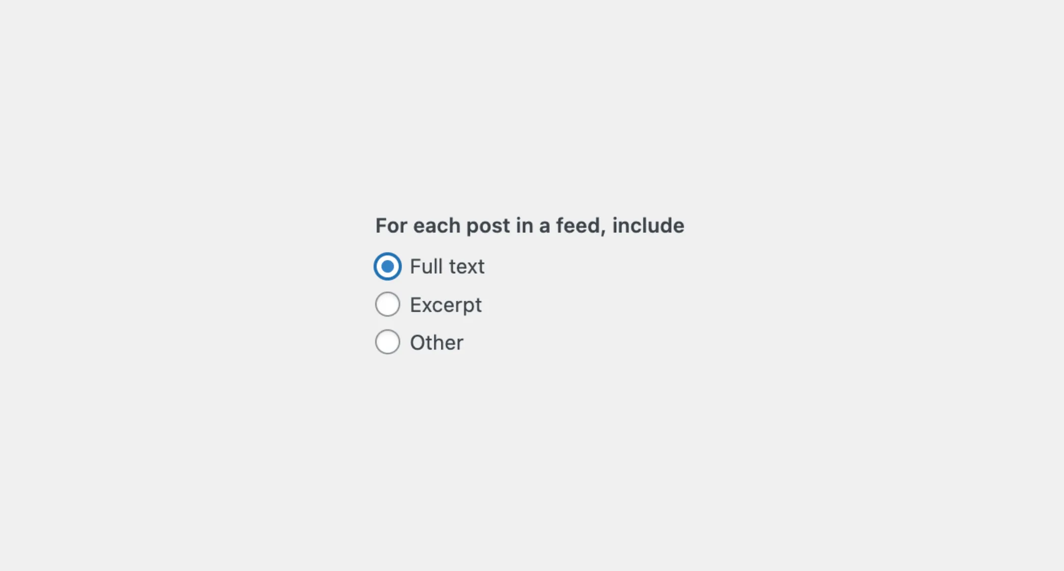
import { RadioGroup, Radio } from "@syntatis/kubrick";Then, you can place multiple Radio components inside the RadioGroup. The RadioGroup should have the label prop to describe the group, and each Radio should have a unique value to identify the selected option.
<RadioGroup label="For each post in a feed, include"> <Radio value="full-text">Full text</Radio> <Radio value="excerpt">Excerpt</Radio> <Radio value="other">Other</Radio></RadioGroup>Disabled
You can disable the options by passing the isDisabled prop on the RadioGroup component.
<RadioGroup label="Choose your favorite color" isDisabled> <Radio value="red">Red</Radio>2 collapsed lines
<Radio value="blue">Blue</Radio> <Radio value="other">Other</Radio></RadioGroup>Making it disabled will disable all the options within the group. User won’t be able to interact or navigate the options, and selected value won’t be passed over on submission.
Read-only
You can make the options as a read-only using the isReadOnly prop.
<RadioGroup label="Choose your favorite color" isReadOnly> <Radio value="red">Red</Radio>2 collapsed lines
<Radio value="blue">Blue</Radio> <Radio value="other">Other</Radio></RadioGroup>When the group is set as read-only, the user can still interact or navigate the options, but they won’t be able to change it. The selected value will still be passed over on submission.
Description
If you want to give extra information about the group of options, you can use the description prop to add a description.
<RadioGroup label="Choose your favorite color" description="This will change the color of the button."> <Radio value="red">Red</Radio>2 collapsed lines
<Radio value="blue">Blue</Radio> <Radio value="other">Other</Radio></RadioGroup>By default, the description will appear as a small text below the list of options. You can change where it appears using the descriptionArea prop. This prop accepts two values: after-input (the default) and before-input. Setting it to before-input will show the description before the list of options, right after the label.
<RadioGroup label="Choose your favorite color" description="This will change the color of the button." descriptionArea="before-input"> <Radio value="red">Red</Radio>2 collapsed lines
<Radio value="blue">Blue</Radio> <Radio value="other">Other</Radio></RadioGroup>Orientation
By default the radio buttons will be stacked vertically. You can change the layout to be horizontal by setting the orientation prop to horizontal.
<RadioGroup label="Choose your favorite color" orientation="horizontal"> <Radio value="red">Red</Radio>2 collapsed lines
<Radio value="blue">Blue</Radio> <Radio value="other">Other</Radio></RadioGroup>Styles
The RadioGroup component has static classes, prefixed with .kubrick-RadioGroup-. You can use these static classes to
select and customize the component and its elements.
| Selector | Description |
|---|---|
root | The component root element. |
label | The element that wraps the label content. |
items | The element that wraps the list of options. |
description | The element that wraps the description content. |
Events
The RadioGroup component will emit some events on user
interactions. You can handle these events by passing a function as a
callback to the following props:
| Event | Description |
|---|---|
onChange | Triggered when the value changes. The function callback will receive the new value. |
Let’s assume you have an app, and you’d like to show an input field when the user selects the “Other” option. You can use the onChange prop to handle this event, for example:
import { useState } from "react";import { RadioGroup, Radio } from "@syntatis/kubrick";
function App() {  const [showInput, setShowInput] = useState(false);
  return (    <>      <RadioGroup        label="Choose your favorite color"        onChange={(value) => setShowInput(value === "other")}2 collapsed lines      >        <Radio value="red">Red</Radio>        <Radio value="blue">Blue</Radio>        <Radio value="green">Green</Radio>        <Radio value="other">Other</Radio>      </RadioGroup>      {showInput && <input type="text" />}    </>  );}