Notice
The Notice component is used to display a message to the user. It can be
used to provide feedback, warnings, errors, or success message in your
WordPress admin application.
Usage
To use it in your app, import Notice from the package:
import { Notice } from "@syntatis/kubrick";Then, you can add it in your app with the content, for example:
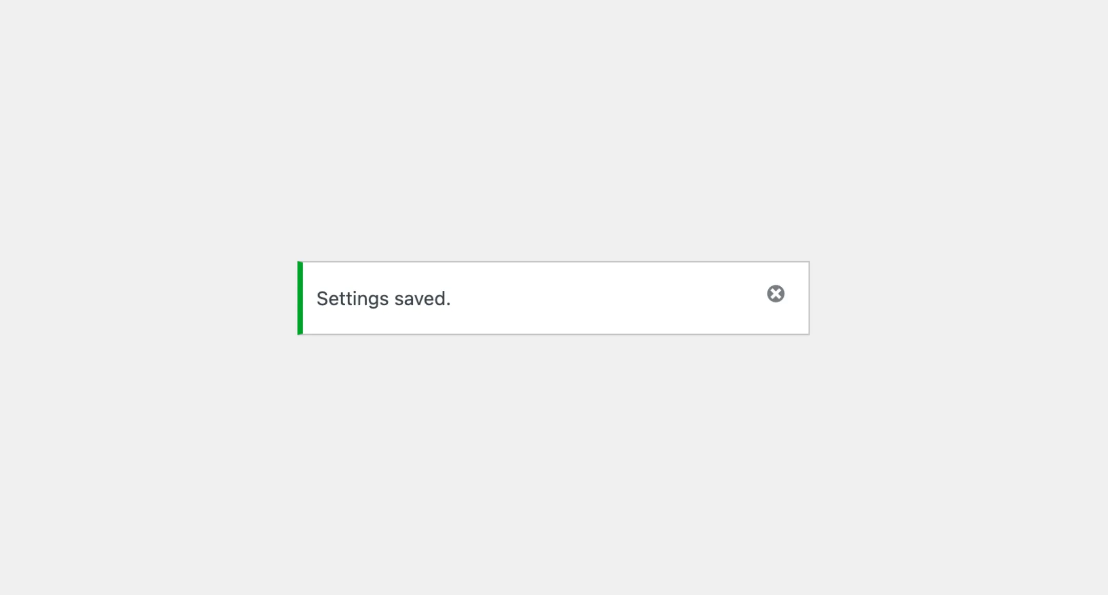
<Notice>Settings saved.</Notice>Level
You can use the level prop to change the color of the notice bar. This is helpful when you want to indicate the significance of the message, such as whether it’s an error, a warning, a success message, or just a general information.
The default value for the level prop is info, which means the notice is a general message. You can change it to success, error, or warning to reflect the appropriate message type, for example:
<Notice level="success">Settings saved.</Notice>Dismissable
Pass the isDismissable prop to the Notice component to make it dismissable. An X icon will appear on the side of the message. When the user click on the X, the message will disappear.
Styles
The Notice component has static classes, prefixed with .kubrick-Notice-. You can use these static classes to
select and customize the component and its elements.
| Selector | Description |
|---|---|
root | The component root element. |
content | The wrapper element the notice message. |
dismiss-button | The button to dismiss the notice. |
Events
The Notice component will emit some events on user
interactions. You can handle these events by passing a function as a
callback to the following props:
| Event | Description |
|---|---|
onDismiss | Triggered when the notice is dismissed. The function callback will not receive any argument. |