Link
The Link component represents the HTML a element. It is used to create an
anchor element that links to another resource or page. It comes with a couple
of variants. It can also be extended with a prefix and suffix to provide
additional context, such as an icon or a badge.
Usage
To use it in you app, import Link from the package:
import { Link } from "@syntatis/kubrick";Then, add it in your app as you would with a native HTML a element:
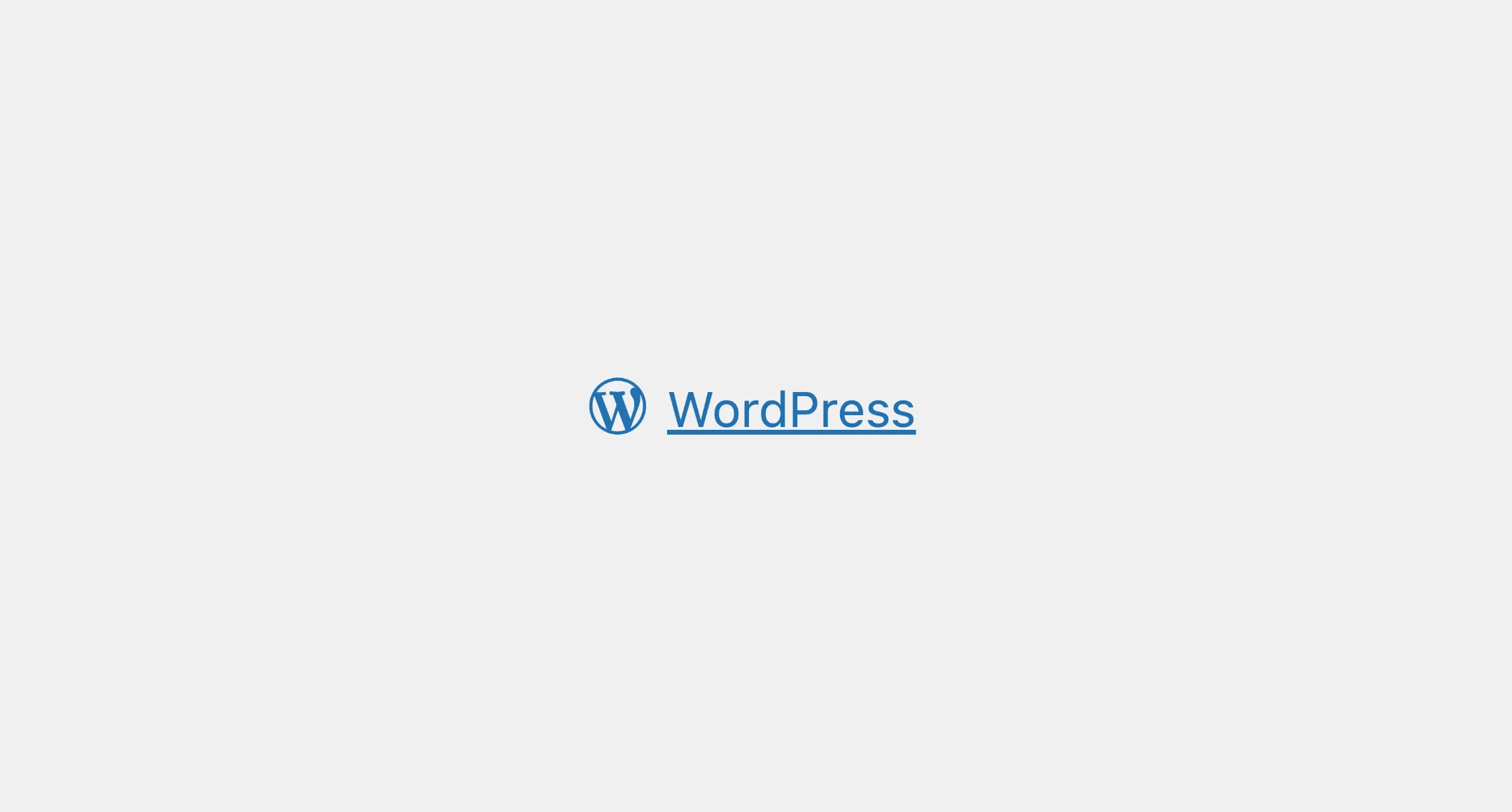
<Link href="https://wordpress.org">Go to WordPress</Link>The Link component inherits several native a element attributes, such as the target and rel attribute. You can pass these attributes as props directly to the component:
<Link href="https://wordpress.org" target="_blank" rel="noopener noreferrer"> WordPress</Link>Affix
You can use the prefix and suffix props to add element before and after the link label. This may be useful if you need to show icon or context for the link.
<Link href="/page"2 collapsed lines
target="_blank" rel="noopener noreferrer" prefix={<Icon name={wordpress} />}> WordPress</Link>Classes
The Link component has static classes, prefixed with .kubrick-Link-. You can use these static classes to
select and customize the component and its elements.
| Selector | Description |
|---|---|
root | The root element of the link. |
prefix | The wrapper element of the prefix content. |
suffix | The wrapper element of the suffix content. |
infix | The wrapper element of the link label when the prefix or suffix is present. |
Events
The Link component will emit some events on user
interactions. You can handle these events by passing a function as a
callback to the following props:
| Event | Description |
|---|---|
onHoverChange | Triggered when the link is hovered. The function callback will receive a boolean value indicating if the link is hovered. |
onFocusChange | Triggered when the link receives or loses focus. The function callback will receive a boolean value indicating if the link is focused. |