Dialog
The Dialog component is used to show a dialog window above the page. In
WordPress, you may see a modal window used on the Media Manager to upload,
manage, and edit uploaded images. But, technically, you can use it to display
any content that should appear above of the main page content.
Usage
To use it in your app, import the Dialog and DialogTrigger component, and another component, like the Button component, that will be used to trigger dialog window.
import { Dialog, DialogTrigger, Button } from "@syntatis/kubrick";Add the Button inside the DialogTrigger component. Then, use the render prop on the DialogTrigger to pass in the Dialog component with the title and the content you want to display in the dialog window:
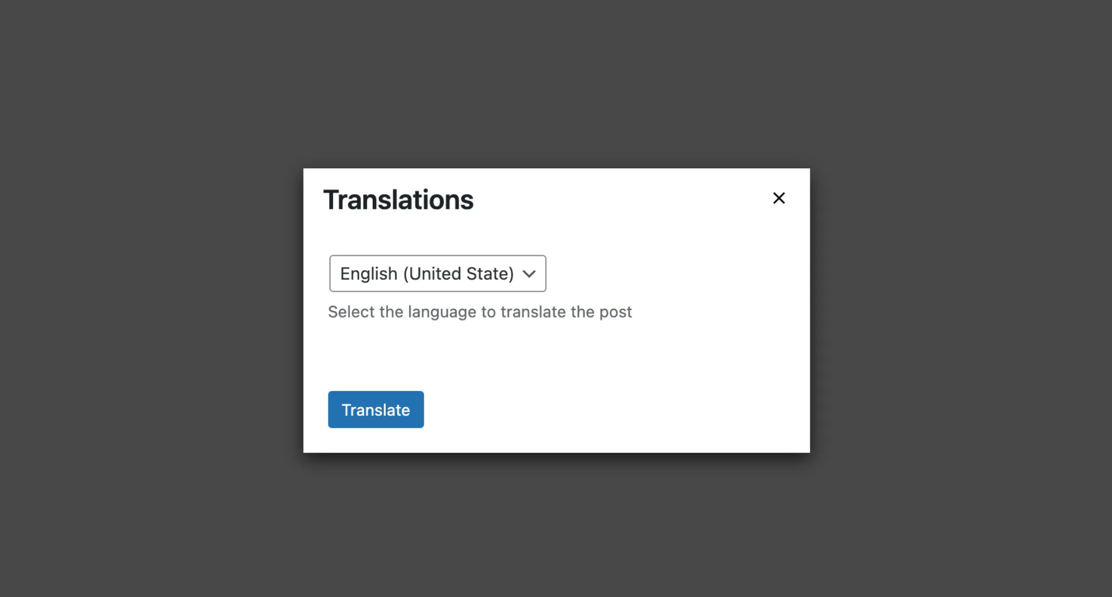
<DialogTrigger render={() => { return ( <Dialog title="Translations"> <Select name="lang" description="Select the language to translate the post" > <Option value="en_US">English (United State)</Option> <Option value="id_ID">Bahasa Indonesia</Option> </Select>3 collapsed lines
</Dialog> ); }}> <Button>Translations</Button></DialogTrigger>Footer
You can add a footer to the dialog by passing a footer prop to the Dialog component. Similar to the Dialog component, the footer section can contain any content you want, although this section is particularly useful for adding actions that the user can take, such as saving or closing the dialog.
The footer prop accepts a function as a callback and will receive a function as the argument, which you can use to close the dialog window. Here’s an example of how to add a footer to the dialog:
<DialogTrigger render={() => { return ( <Dialog title="Translations" footer={(close) => { return ( <> <Button onPress={close}>Cancel</Button> <Button onPress={() => { // Do the translate API call. }} > Translate </Button> </> ); }} > <Select name="lang" description="Select the language to translate the post" >4 collapsed lines
<Option value="en_US">English (United State)</Option> <Option value="id_ID">Bahasa Indonesia</Option> </Select> </Dialog> ); }}> <Button>Translations</Button></DialogTrigger>Styles
The Dialog component has static classes, prefixed with .kubrick-Dialog-. You can use these static classes to
select and customize the component and its elements.
| Selector | Description |
|---|---|
root | The root element of the dialog window. |
modal | The root element of the modal overlay. |
title | The title section of the dialog window. |
content | The content section of the dialog window. |
footer | The footer section of the dialog window. |