Button
The Button component is similar to the HTML button element, but with some
additional features and flexibilities. You can use this component to allow
users to trigger actions or events through clicks, touch, or keyboard input.
Usage
To use the component, import Button from the package:
import { Button } from "@syntatis/kubrick";You can then add it to your app just like a regular HTML button element:
<Button>Save Changes</Button>Type
By default, the Button component behaves like a standard HTML button. You can change the button type using the type prop, for example, to make it a submit button:
<Button type="submit">Save Changes</Button>Disabled
To disable the button, use the isDisabled prop. This is useful when the button shouldn’t be clickable, such as when a form is incomplete or the user lacks permission to perform an action.
<Button isDisabled>Save Changes</Button>Variants
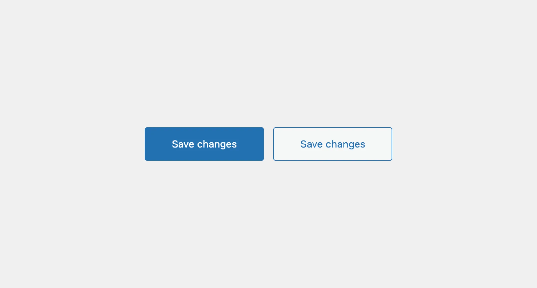
The Button component comes with different style variants, and can be customized using the variant prop. The default variant of the component is primary, but you can switch to link, link-danger, or secondary to suit the button’s role.
<Button variant="secondary">Create new</Button>Sizes
You can also choose from different button sizes. You can change it using the size prop to small, large, or hero following on the context or importance of the button.
<Button size="small">View</Button>Affix
The Button components comes with prefix and suffix props to to allow you to add content before or after the button label. You can add any type of content, but typically you would use these props to add icons.
import { Icon, edit } from '@wordpress/icons';
// Add an icon after the button label<Button suffix={<Icon icon={edit} />}>  Edit</Button>
// Add an icon before the button label<Button prefix={<Icon icon={edit} />}> Edit</Button>Loading
You can add loading prop to show the button on the loading state. This is useful when the button triggers an action that requires some time to process.
<Button loading>Please wait...</Button>When the button is on the loading state, it will show a spinner and the button will also be disabled to prevent multiple clicks.
Styles
The Button component has static classes, prefixed with .kubrick-Button-. You can use these static classes to
select and customize the component and its elements.
| Selector | Description |
|---|---|
root | The root element of the button. |
prefix | The wrapper element of the prefix content. |
suffix | The wrapper element of the suffix content. |
infix | The wrapper element of the button label, when the prefix or suffix is present. |
Events
The Button component will emit some events on user
interactions. You can handle these events by passing a function as a
callback to the following props:
| Event | Description |
|---|---|
onPress | Triggered when the button is clicked. The callback function will receive the click event as an argument. |
onHoverChange | Triggered when the button is hovered. The callback function will receive a boolean indicating if the button is hovered. |
onFocusChange | Triggered when the button receives or loses focus. The callback function will receive a boolean indicating if the button is focused. |
Let’s assume you have an app with the Button component to save or updates settings. When the user click on it, you want to show the loading state and disable the button to prevent multiple clicks.
You can achieve that by using the onPress prop to handle the click event and add the loading prop to show the loading state.
import { useState } from "react";
function SaveButton() {  const [isLoading, setIsLoading] = useState(false);
  function handleSave() {    setIsLoading(true);5 collapsed lines
    // Simulate the saving process...    setTimeout(() => {      setIsLoading(false);    }, 3000);  }
  return (    <Button      loading={isLoading}      onPress={handleSave}>      Save Changes    </Button>  );}