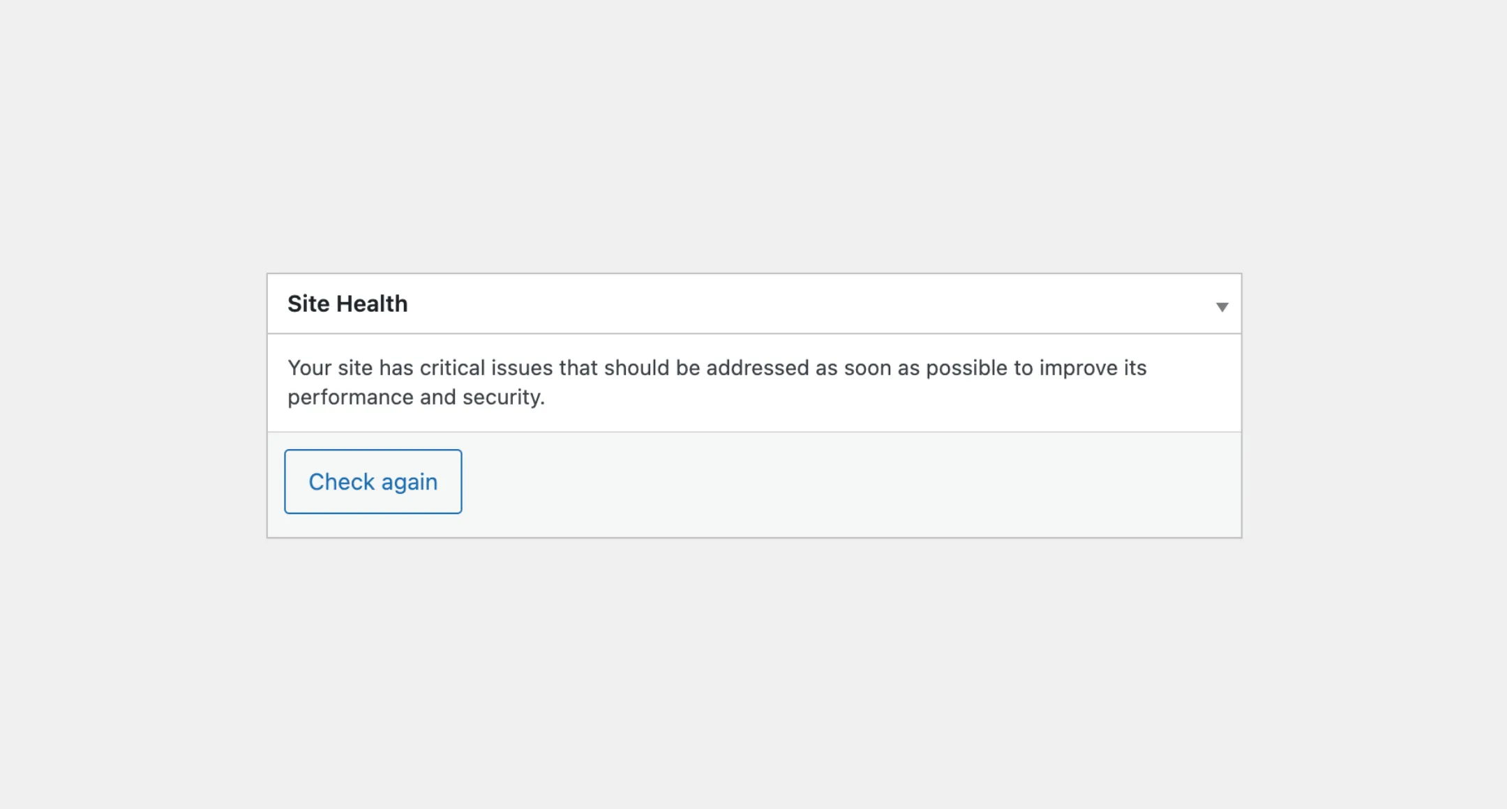
Box
The Box component is a container commonly used in WordPress for metaboxes or
widgets on the Dashboard. It comes with a title and content section and can
be set to be collapsible, allowing you to hide or show the content. You can add
various types of content to the box, such as text, forms, charts, or any valid
React components and HTML elements.
Usage
First, you need to import the Box from the package:
import { Box } from "@syntatis/kubrick";Then, to use it in your application, you’ll need to provide a title for the box and the content as its children. The content can be a string, any valid HTML elements, or React components.
<Box title="Site Health"> <p> Your site has a critical issue that should be addressed as soon as possible to improve its performance and security. </p></Box>Collapsible
As mentioned, you can make the Box component collapsible. You can do this by adding the collapsible prop. This will add a toggle button to the header section that you can click to hide or show the content.
<Box title="Site Health" collapsible> <p> Your site has a critical issue that should be addressed as soon as possible to improve its performance and security. </p></Box>Footer
You can also add a footer section to the box by adding the footer prop. Though you can add any valid element or content on the footer section, the footer section is particularly useful for adding buttons or other related type of actions.
<Box title="Site Health" footer={<Button variant="secondary">Check again</Button>}> <p> Your site has a critical issue that should be addressed as soon as possible to improve its performance and security. </p></Box>Styles
The Box component has static classes, prefixed with .kubrick-Box-. You can use these static classes to
select and customize the component and its elements.
| Selector | Description |
|---|---|
root | The root element of the box. |
header | The header section containing the title and toggle button. |
title | The wrapper element of the title. |
content | The content section of the box. |
footer | The footer section of the box. |
